Save yourself some pennies this Christmas.
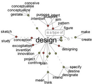
Designers' often find that the software tools we need for our work are expensive. If you are just starting out in design and you are keen to save money (who isn't?) then you need to investigate some of the free or low budget software that is available to download on the web.
You would assume that much of it wouldn't be worth your hard drive space, but suprisingly there's some great free software (for both Mac and PC) that you don't have to spend a penny acquiring. The following list will help you save some serious money:
Photo and Image editing programs:GimpIt's hard to move away from Photoshop but there is a free alternative to this great graphics package, for those on a budget. GIMP which can be downloaded for free from
http://www.gimp.org is a very powerful image editor with channels, levels and masking tools. The program comes with a basic set of graphic tools, but you will find hundreds of plug-ins for the program. It's not as good as photoshop but well worth it for those on a budget.
PixiaIt's similar to GIMP and offers mask and layer editing for images. It seems a little more complicated to use. Both programs have their own benefits. Download from
http://park18.wakwak.com/~pixia/ and watch out for people selling this software, it's supposed to be free.
InkscapeIs a vector graphic drawing tool, it's suitable for a wide range of vector applications. In particular, it is widely used for creating images such as a logo, icons, flags, maps, diagrams, etc. A nice starter graphics program, before buying Illustrator. Download it here
http://www.inkscape.orgWe suggest that these 3 programs are the best freeware replacements for Photoshop and Illustrator. But they will never beat the capabilities of those 2 programs.
3D Programs:BlenderOpen source 3D modelling, rendering and animation program. It has a steep learning curve but it's very well made and can do almost any 3D work, from buildings to small objects. A really great value program and it can be downloaded from:
http://www.blender3d.com/SketchupDeveloped for the conceptual stages of design, SketchUp is powerful yet easy-to-learn 3D software, it's more focused on 3D scenes and landscapes. The basic version comes free from Google at
http://www.sketchup.com/Video Editing:Jahshaka 2Offers realtime video editing. It allows the user to add effects over the top of video. Download it for free from
http://www.jahshaka.orgWeb Design:NVUNVU (pronounced N-View) is a web design program using a WYSIWYG editor which will help you create your first web sites. It has a great interface and can be easy to use. It isn't the best at controlling databases but it can work with PHP. Download this free web design program here:
http://www.nvu.com/index.phpComposerMozilla's Composer comes together in a free package called SeaMonkey. Composer allows you to edit your own web pages again in this WYSIWYG editor. It does not allow form management but offers many other features (such as source editing), it's worth downloading from
http://www.mozilla.org/projects/seamonkey/Also note that Mozilla produces Firefox (the increasingly popular free web browser) and Thunderbird (a mail application that allows HTML editing of emails, so you can make e-cards). Both can be downloaded from the same web site at
http://www.mozilla.orgAudio:AudacityThere are also times when a designer might need to record audio (i.e. for either a presentation or a web site). Audacity is a great free program for recording audio and saving it as multiple formats. It can be used on both MAC and PC and details and the download can be had here:
http://audacity.sourceforge.net/ or as we found the download isn't always working you can get the files from
Sourceforge.net.
For more free graphics programs you can search for what you need at
www.download.com or
www.versiontracker.com (some of which require small payments for their use).
There are other options to free software for new start-ups. The big major companies are all offering (save enabled) 30 day trial versions of their software to download and use for free (most have no obligations but do read the small print). So our final recommendation would be to go to
www.adobe.com for a free trail of their products which now also include all the Macromedia range (from Flash to Freehand). At least you can start work for free with all the above options, have a cost effective Christmas.
If you know of any free software programs that you think the design community might be interested in, then please add a comment to this post with a link.

 They have a great starter guide for using essential oils here.