
News Map
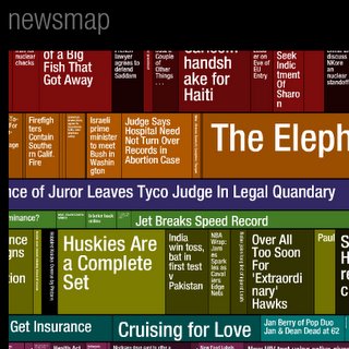 A great Tree Diagram/Map that is generated using the google news aggregator.
Designed by Marcos Weskamp who runs a great interactive media site at www.marumushi.com
It's objective is to simply demonstrate visually the relationships between data and the unseen patterns in news media.
However, it's also a great way to visually represent the news in a cartographic and diagramatic way. Well worth bookmarking.
Permalink at Tuesday, November 15, 2005
![]()
![]()
<< Home